|
For this assignment I was challenged to make a basic company and make a design for that company. I first had to make 15 logos and then choose three of them. Then with the three logos I was asked to make variations of them using different colors. Lastly I was asked to choose one out of the nine logos. The most frustrating problem with this task was probably brainstorming 15 ideas because i'm not that creative and I can't really think of ideas that fast. My favorite part of this was vectorizing it because I got to make the logos that I came up with and it was pretty cool seeing them as a virtual design. From this experience I was able to learn how to vectorize physical drawings. 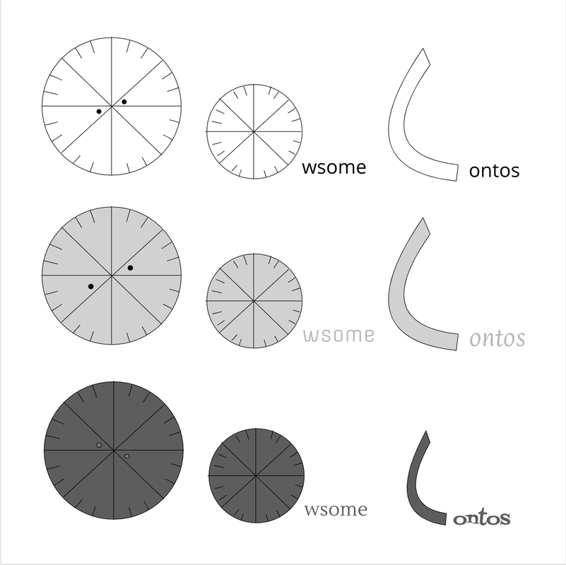 The name of my brand is called Jacoria and is a 24 hour convenience store, however, it's sort of a like nicer convenience store and it sells a lot of other things that you might not have expected. For example Jacoria sells things that you would usually buy at places like walmart or target but in a smaller more compact space. I named it Jacoria because Jacosie is my like username for a lot of different games or apps so I took that name and modified it to Jacoria. I chose to make this logo because if you count the lines there are actually 24 lines and it represents how the convenience store is open for 24 hours. I chose this logo out of all of the other logos because it looks the best in my opinion and it doesn't have any words with it. 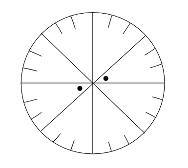
0 Comments
The logo I made was for a convenience store company because I wanted to make a fast and convenient store that sold a variety of different things such as foods, drinks, and a lot of different utilities. I chose these three signs because I like the clock and a I also like the Contos sign. I'm still trying to figure out whether to use the name Contos or Owsome because I like both of the names. However, I don't like the ones with shapes in other shapes because it looks simple or ugly. This whole process was ok but I did like the idea of coming up with your own logos. 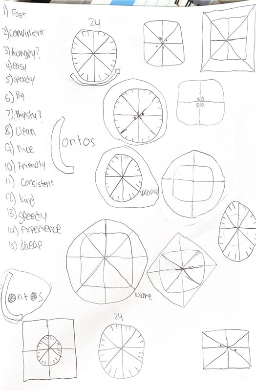 Color TheoryFor the first assignment I had to label the colors with their hex code and their RGB values. For the second assignment I had to make a design that used different design patterns and then label their hex codes. For these assignments it wasn't too hard, but it took a long time to replicate the hex codes and the RBG values. One of the best parts of this project was learning about different design patterns like monochromatic designs, and complementary designs from the adobe color website. I'm very happy with the gradient of the first design and the design patterns of the second design. For the first design I wanted to use the color black and make a gradient so I made a white and black gradient. For the second design I just chose mostly bright colors, and put them together. Color Names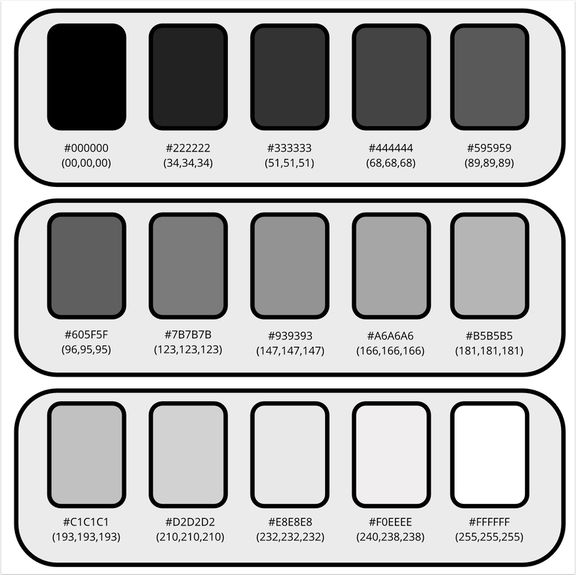 Color Schemes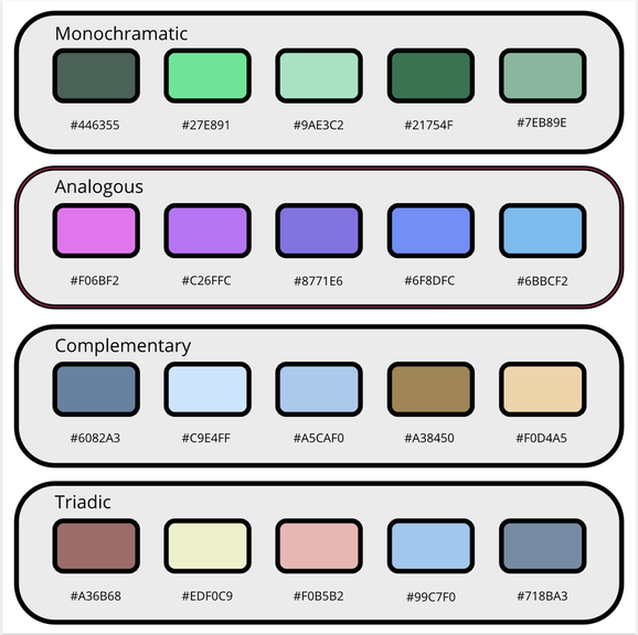 Typography: Typography is the art and technique of arranging type to make written language legible, readable, and appealing when displayed. This unite I have learned a lot about typography and how to use it to make my designs look much better. Typography is important to learn because if you don't have a good idea of what it is then you won't be able to create good designs that will catch people's eyes. The quote “Each font has a personality and a purpose," also better explains typography because each font has a personality that makes it its own with its own purpose for different designs. In this class we have learned about 5 different fonts, Serif, Sans Serif, Monospace, Novelty, and Script. Serif is a font that has little feet on the ends of each letter making them look a little more fancy. Sans serif is a font that doesn't have feet. This is seen on a lot of objects and you even probably write like that. Thirdly, monospace is a font that makes the equal amount of space between each letter in a word. This is mostly seen in like codes and is not used much. Fourthly there is novelty, and novelty is a font that catches people's attention. These types of fonts are not commonly used. Lastly there is Script, and script is a type of handwritten font. This is mostly seen in cursive or other types of fancy fonts. Typeface ComparisonFor the typeface comparison task I had to choose 5 different fonts that matched each the fonts mentioned before. Then I would have to label there name and write out a sentence using each of the fonts. 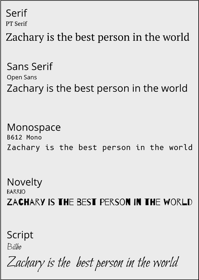 Word PortraitFor the word portrait activity we were asked to create a design with one column of words that match each of their fonts and another column where we write words that don't match that font. Then at the end we had to label the fonts we used. 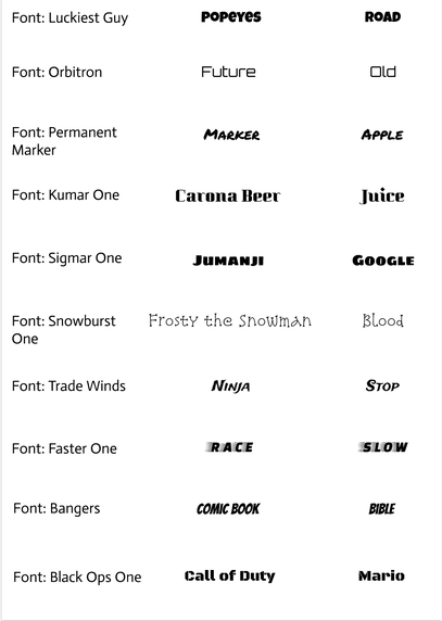 For this assignment I cut out Aaron Gordon when he was dunking in the 2016 dunk contest and then put him on a toilet. I was assigned to cut out an object and combine it with another picture. The purpose of the pen tool is to draw things and then u can cut them out of pictures or make an overlay on top of pictures. I chose to made this illustration because I thought it would be funny to put him sitting on a toilet. During this project one of the main challenges I faced was cutting out Aaron Gordon well enough so that you couldn't see any of the background. 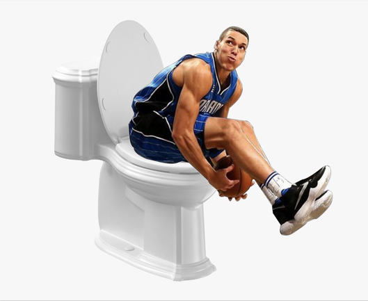 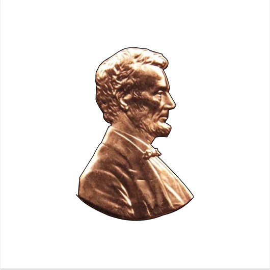     Today I created the "nIGHTMARE" by drawing with code on Kahn academy. I titled this picture the "nIGHTMARE" because when I was younger I had a lot of nightmares that had faces like this. When making this project I learned how to make different shapes with different types of code. I think it's useful for us to learn about drawing with code because it shows us that computer have to do this when we are using editing websites like Gravit. It's also important for us to learn about this because some of our jobs when we grow up are going to include coding. 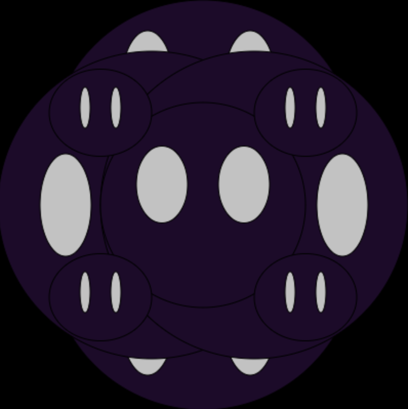 fill(0, 0, 0);
rect(0,0,500,500); fill(31, 9, 43); ellipse(200,150,300,300); fill(194,194,194); ellipse(146,80,50,100); ellipse(246,80,50,100); fill(31, 9, 43); ellipse(200,250,300,300); fill(194,194,194); ellipse(146,316,50,100); ellipse(246,316,50,100); fill(31,9,43); ellipse(150,200,300,300); fill(194,194,194); ellipse(66,200,50,100); fill(31,9,43); ellipse(250,200,300,300); fill(194,194,194); ellipse(336,200,50,100); fill(31,9,43); ellipse(200,200,200,200); ellipse(100,110,100,85); ellipse(300,110,100,85); ellipse(100,290,100,85); ellipse(300,290,100,85); fill(194, 194, 194); ellipse(160,180,50,75); ellipse(240,180,50,75); ellipse(85,105,10,40); ellipse(115,105,10,40); ellipse(285,105,10,40); ellipse(315,105,10,40); ellipse(85,285,10,40); ellipse(115,285,10,40); ellipse(285,285,10,40); ellipse(315,285,10,40); This is my Gravit summative project that I have been working on. The objects on the screen represent "Bears, Beets, and Battlestar Galactica." This scene is important to me because it comes from my favorite show The Office when Jim is impersonating Dwight. I chose this scene because it was one of the funniest parts in all of the show and it's pretty iconic when describing Dwight's character. Link 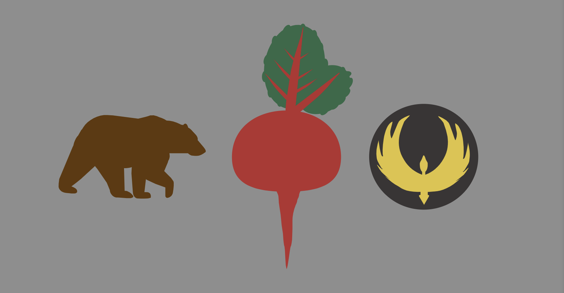 This lesson I learned how to change the corners and I also learned how to Union, Subtract, Interact, and Difference shapes to make them look unique.  I learned how to layer different shapes to make them look cool and unique. I also learned that I can group the shapes together so that all edits will be made to everything that's grouped. 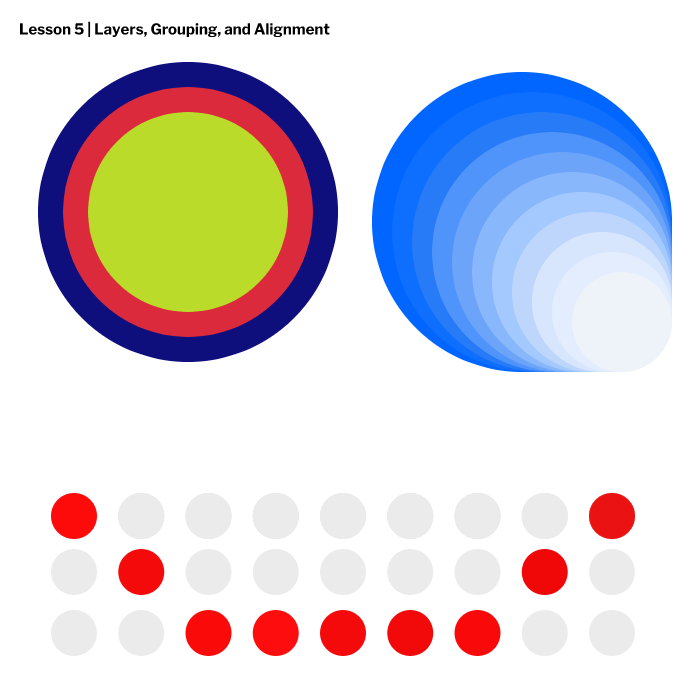 This lesson I learned how to Align borders and make the corners of the borders different. 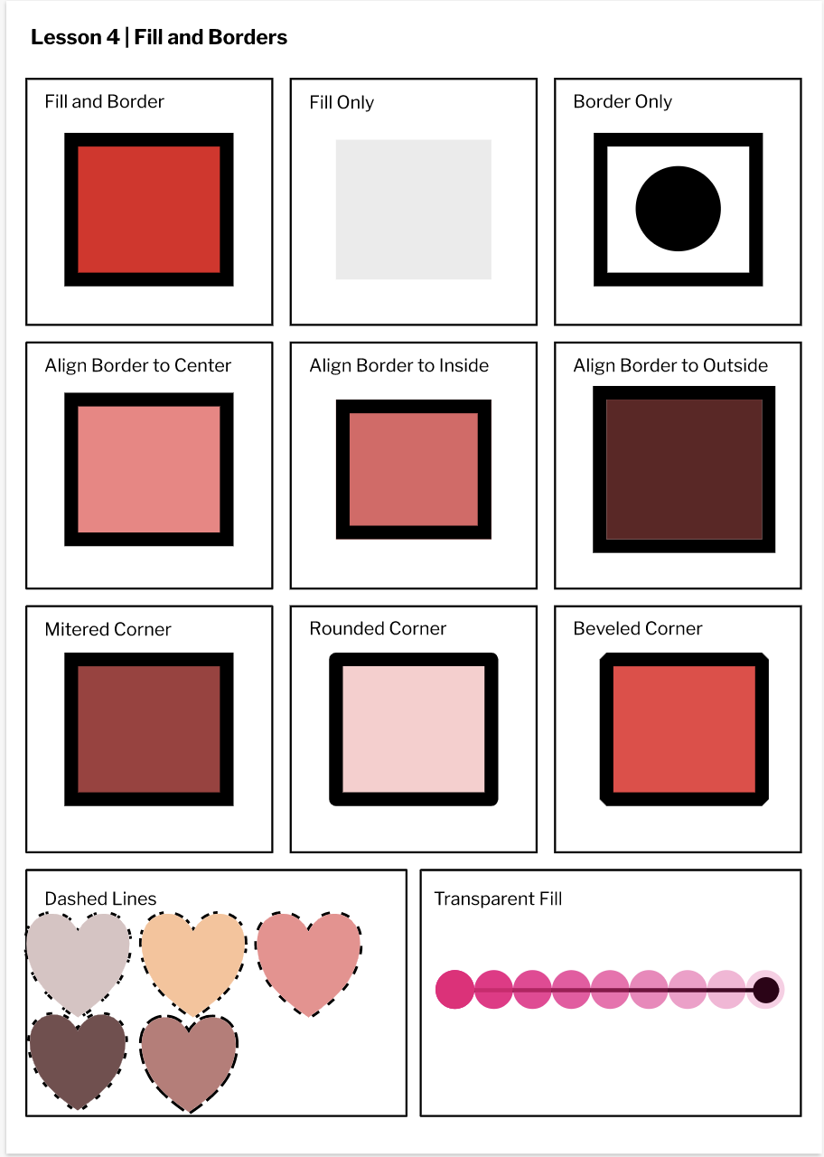 |
|
 RSS Feed

